If you’ve spent any amount of time research WordPress themes or using them for your own web design business, you know that white space is not only a trend, but an obsession. The idea behind the color white is that it creates breathing room for your content, while also letting off a clean and modern look.
Unfortunately, this leaves the color black in the dust, since for whatever reason, people tend to shun black, because it’s the opposite of white. The only problem with this reasoning is that the white color is not what’s making designs look clean and modern, but rather the amount of white that is used. When black is implemented properly it has the same effect as white space.
Not to mention, black websites let off an elegant and wealthy vibe, which both men and women are known to enjoy. Since dark websites offer wonderful ways to stand out from the crowd, we put together a list of the best black websites for your inspiration. Use them to prompt creativity in your own designs, and feel free to save the suggestions as bookmarks for later. Without further ado, here are the top black websites online.
01. Esteban Muñoz

The Esteban Muñoz portfolio is a solid place to start out for your black website inspiration, since it shows you how versatile a portfolio can be with a black background, allowing you to stand out from the tons of white portfolios online, while also adding graphics to the background to show your creativity.
You’ll notice how powerful a black website looks with bright white typography and animated graphics towards the bottom. Not to mention, the black elements help put some focus on your portfolios items, as you can see in the slider to the right.
02. Hangar Door

The Hangar Door website has more of a gray/black background, with steel textures to coincide with the fact that the company sells hangar doors. The website is a great example of a darker layout, since it correlates with the mission of the company and looks great with the nail graphics and branded social media buttons.
03. Jef Finley
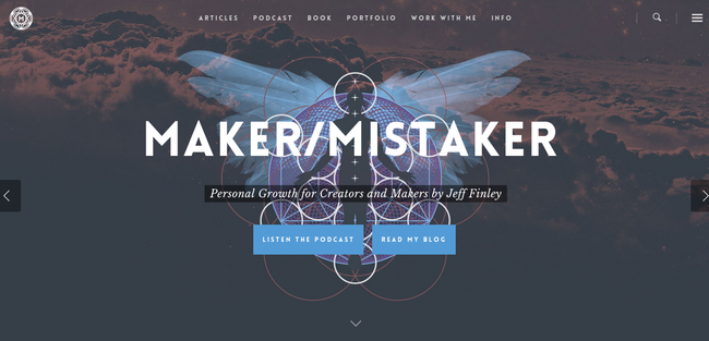
This is a website called Maker/Mistaker, which is a personal growth podcast and blog created by Jef Finley. This is a wonderful example of how darker elements combine well with lighter components of the website, since the entire header area features a darkened parallax image with overlaying text and buttons to things like the podcast and the blog.
This is a prime example of how you can add some juxtaposition to your site.
04. Anderbose
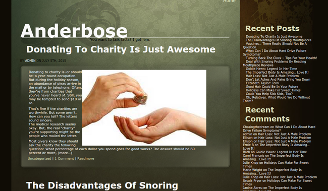
The Anderbose site isn’t exactly a solid shade of black, but it utilizes everything from black to brown and even white. Anderbose provides a wonderful look into how you can use darker shades to display your own personal blog, where the blog feed sits to the right and the darkened colors put most of the focus on the written words.
05. 1MD
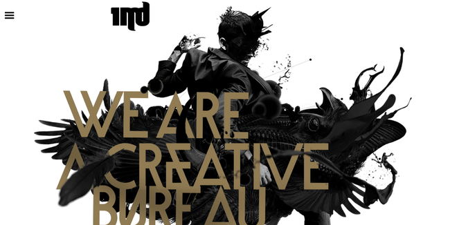
The 1MD website is one of our favorites on the list, because much of it actually features a white background, However, the true inspiration comes from the black graphics sitting on top of that background.
As you can see, a man with interesting designs surrounding him is the first part of the website you notice, along with portfolio suggestions and typography towards the bottom of the site that is all done in black.
06. Take the Walk
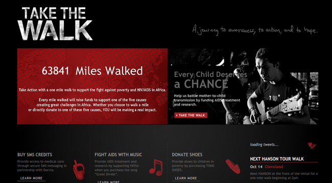
Take the Walk is a charity that strives to convince people to walk a mile in order to prevent AIDS and poverty. The majority of the background is covered in black, and accents are highlighted in red, displaying how black is one of the best colors to work with, since you can use just about any other color as an accent.
07. Sawyer Hollenshead

Sawyer Hollenshead is a frontend developer, and this is a portfolio and blog with ramblings from the web developer. The reason we enjoy this black website is because the very top module is completely black, bringing your eye to the most important content, that being the navigational menu. You can decide to look at the portfolio, written content or even the photos provided.
08. Versions
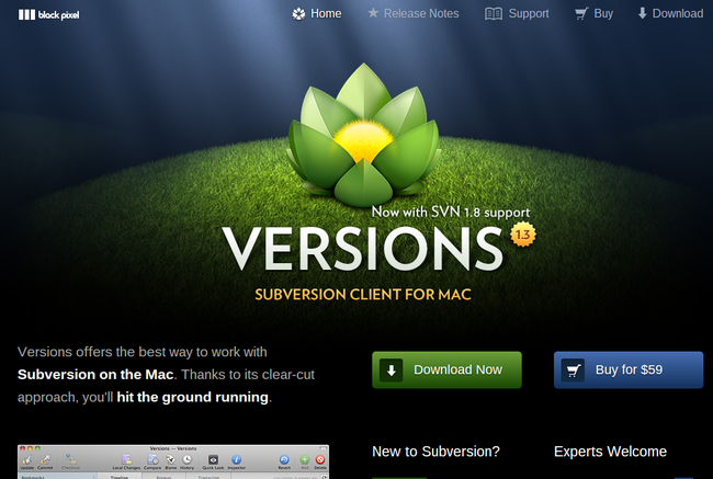
The Versions website is featuring an app for Mac, and it shows how just about any type of technology company can stand out with a few changes towards a darker interface. The Download and Buy buttons are clear due to the coloring, and the lighter screenshots make it easy to understand what the app is all about.
09. Don Q
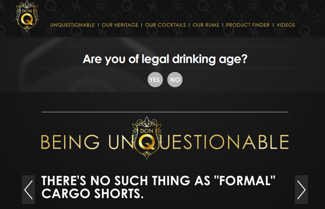
Don Q is a rum company, and its use of black colors reveal how elegance and sophistication appears when you go with a black background. Almost every part of the Don Q website is colored in black, and they use combinations of white and gold typography to add to the elegant atmosphere.
10. Mad About Architecture
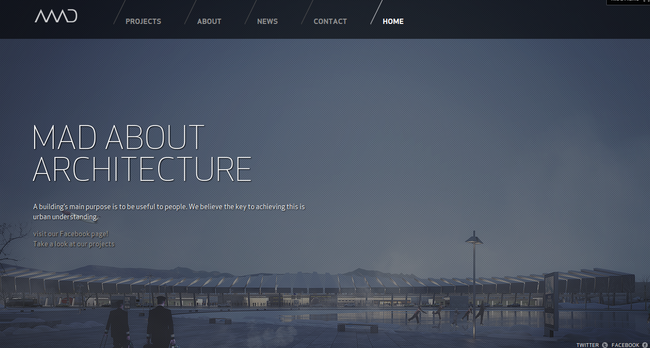
The Mad About Architecture website is a portfolio for an architectural firm, and all of the animations between pages is completely black. The navigational menu is clear, and the darkened shades provide a sense of professionalism and strength, which isn’t a bad vibe to let off when you’re a company that makes buildings.
11. Void
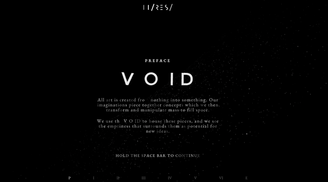
Void puts a focus on stunning space and time animations, bringing you through a story based solely on visuals. Each page is almost completely black, offering a sense of wonder and ominous feelings.
They complement the dark colors with tantalizing tones and music. You can then click around the website to enjoy the narrative.
12. 99 Properites and Power
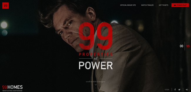
99 Properites and Power is a movie website, and it also includes music and other media elements of which are all presented in darker color shades. As you scroll down with your mouse you can see other pictures from the movie and click on clear social media buttons and navigational tabs towards the top.
13. Sennheiser

Sennheiser is a company that sells headphones, but this is an additional site from the business, allowing you to truly experience the power of audio and video. Many of the visuals offered through the site are provided in black and grey, helping you see the navigational buttons and adding to the experience presented.
14. Blake Allen

The Blake Allen website is a portfolio, and it’s all about simplicity. So many designers think they have to add loads of animations and elements to make their portfolio stand out, but Blake Allen offers a varied approach, with large white typography over a black background.
This is a wonderful site for inspiration, since it only has a few links and minimal design components, yet it’s still rather powerful.
15. Blue Cadet

Blue Cadet is a design firm that understands the power of a black website, since it has a video running towards the top of the page, but its primary color is black. When you scroll down on the website it reveals some lighter elements, which adds to the experience with the contrast.
As you scroll down on the site you’ll see that the navigational menu generates a completely black background, making it easy to see the white links.
16. Let It Bleed
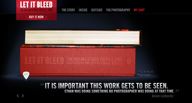
Let It Bleed is a book website that places all eyes on the book cover by utilizing a significant amount of black in the background. What’s interesting about this site is that the testimonials and quotes from the book are clearly visible because the large white typography stands out so much.
17. Blissfully Aware
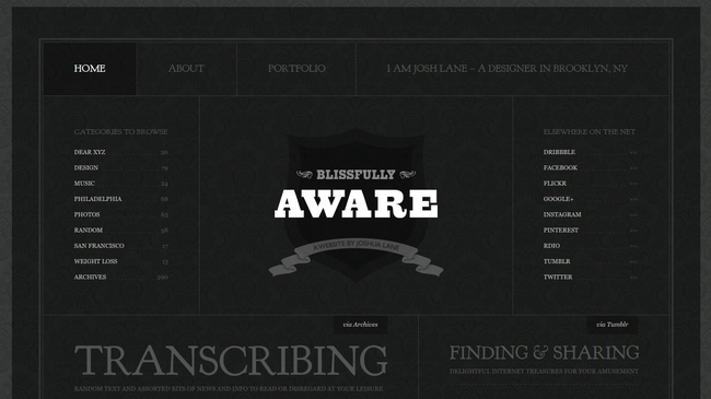
The Blissfully Aware website offers a retro style with a black background. There aren’t many moving parts on the site, but this makes it all the more useful, since you can see most of the navigational buttons on the screen.
The logo is front and center, and the black background clearly reveals all of the links throughout the page.
18. The Old State

The Old State company is a web design, development and branding business, with a black header and footer to not only show off the firm’s creativity, but to clear out the clutter and guide visitors to exactly where they need to go.
You’ll notice that animations and videos look great with black backgrounds, since they seem to flow well and pop out for the viewer.
19. Leah Haggar
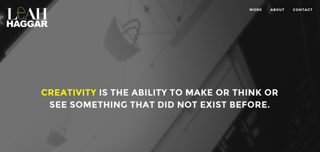
The Leah Haggar portfolio has plenty of lighter areas, but the primary header and footer modules are darkened and powerful, using a combination of videos, large typography and even a wonderful About area in the footer that is quick and easy to read.
This About text is centered, adding to the usefulness of the black background, since nothing else is cluttering the space, and it simply looks like that’s exactly where your eyes are supposed to go.
Over to You…
Now that you’ve had a chance to see some of the best black websites for your inspiration, let us know in the comments if you have any other black websites that get your creative juices flowing. Feel free to bookmark these pages for your own use, and jot down why they stand out to you.
No comments:
Post a Comment